Pictures of the Earth
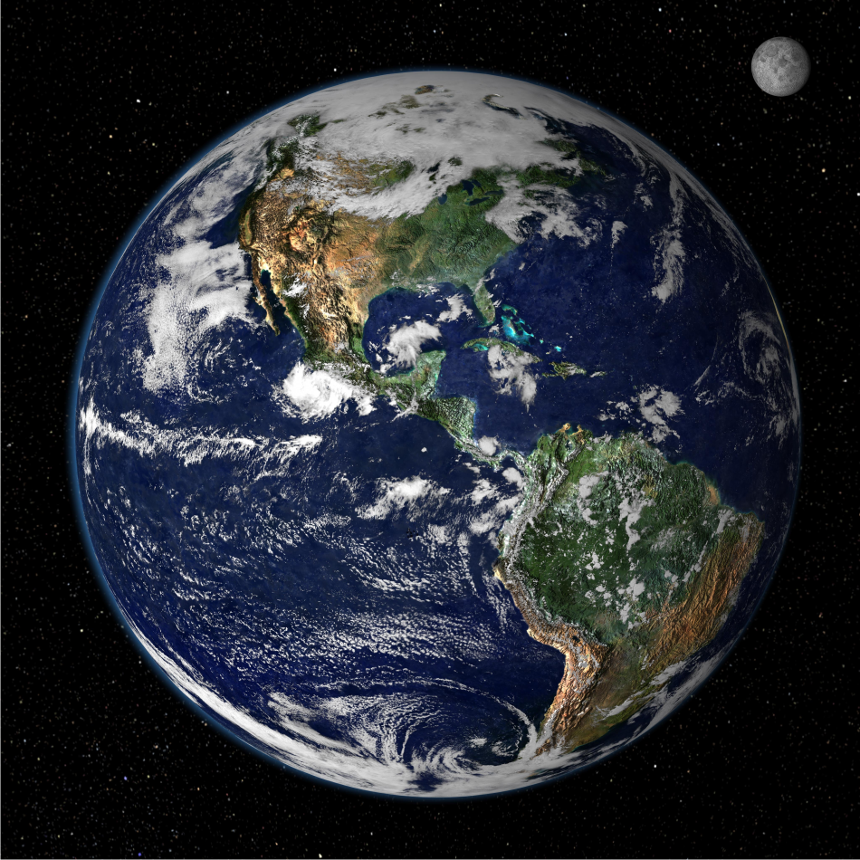
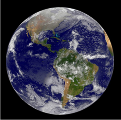
This is an official Earth picture from NASA's site. So comforting ... but wait ... it's wrong!
|
|
There's no room for Asia. Canada's four time zones stretch halfway around the globe. The Earth is known to be 8,000 miles across so we must be about 3,000 miles up. That would put the moon at maybe 20,000 miles. But where in the moon's orbit is that location? Does that image even resemble the moon?
Look how dark it is in Baja at 2:00 pm. Those mountains must be 100 miles high! Photographic sources don't make contiguous blocks of luminescent color. This image is wholly computer generated.
|
But that doesn't make any sense. This is their widely republished official poster-shot blue marble. Why wouldn't they just use a photograph? They say they go up there all the time so they must have thousands of pictures.
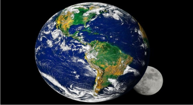
It even gets recycled. Can you see that this is the same image with a different cloud layer painted on and with the moon in another impossible position? This one is starless.
|
|
|
Why would they claim that this is a retouched photograph when it obviously isn't? This is not a casual image. It took a lot of work by top graphics professionals. If you think it's easy, pull up your favorite image creation program and try and make something with this complexity and this level of detail. If you work at it for a week, you'll see you're nowhere close.
This raises another question. They put a lot of work and money into that fake image. Then they said it's a photograph. Why would they go to all that trouble and expense?
|
|
Perhaps it's an anomaly. There must be thousands more, yes? But oddly not. NASA releases a new Earth picture, on average, once every four years.
para
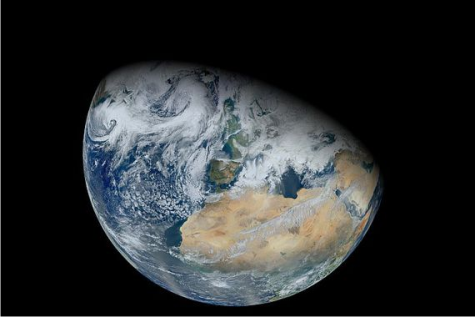
I pulled up another official picture for which NASA fans held bated breath for four long years. As you can see, the projection makes no sense. Africa takes up half of the globe leaving no room at all for the Americas. With no spectacular shadowed mountain ranges like the last picture, this one seems plain and a bit flattish.
|
|
|
|
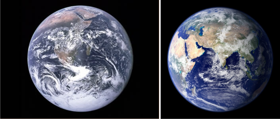
This image looks quite unlike the last one, and as clearly as before is not a photograph. There are only about a dozen official "photographs" and every one has an impossible projection. In one, the United States takes up almost half the globe.
|
|
Bending over backwards now to try and find a "benefit of the doubt" for our vaunted space agency, I speculate that there could be another reason for the strange projections. Suppose, for instance that the picture was taken with a fisheye lens from just 400 miles up. But no. No plausible camera or lens could produce any of these images of our round Earth from space.
|

|
|
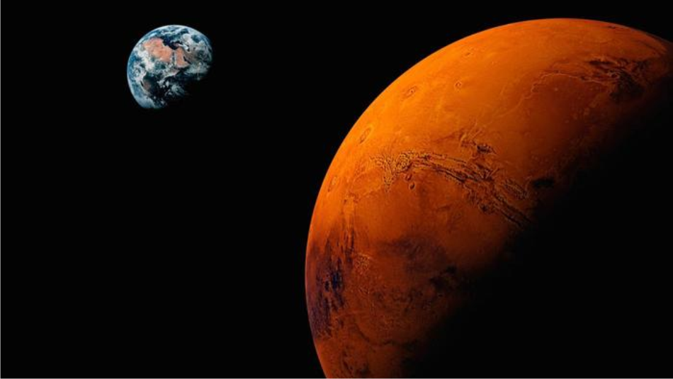
You can always count on NASA for the finest entertainment. Here's the Earth from Mars. The closest approach is millions of miles so that's a helluva telephoto lens. As we have come to expect, Africa takes up half of the globe. No stars this time. Casual inspection of the image shows telltale aliasing at the edges of the Earth and Mars images, so you can see that the planet images were just pasted onto a black background without proper compositing. It is equally clear that neither image is an actual photograph.
|
|
Many Youtube videos quote a BBC documentary showing outtakes from the 1969 mission as the capsule was darkened and a high altitude picture of part of the Earth was taken through a round window.
These are official images. Officially we have been a spacefaring race for fifty years. Digital cameras are robust and cheap. The skies are full of satellites eager to retransmit the data. It is impossible to believe that we don't have 24-7 footage of the Earth from forty angles.
So why does NASA say these are photographs? They are poorly done. How can anyone believe they are real? And why does NASA go to such elaborate expense to produce fake images? After all, they are up there all the time. They must have lots of pictures. Are they hiding them?
|