
|

|
|
|
|
|
||
|
||
|
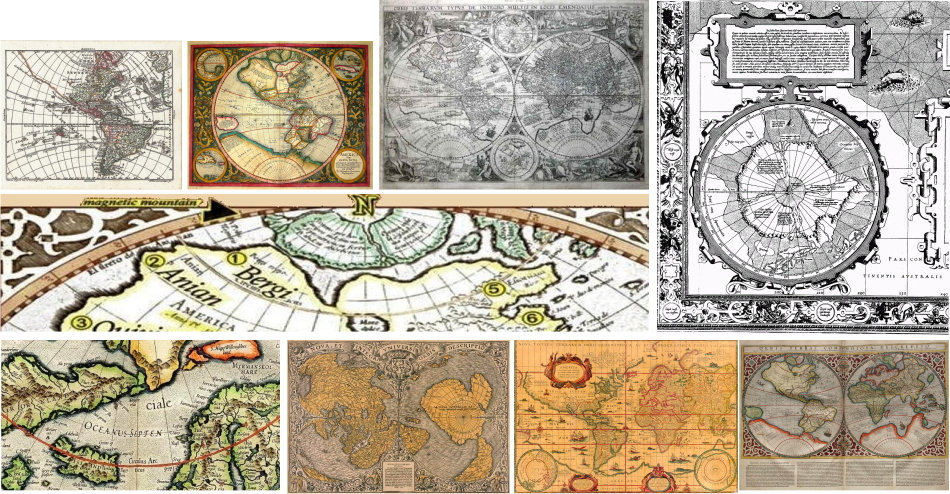
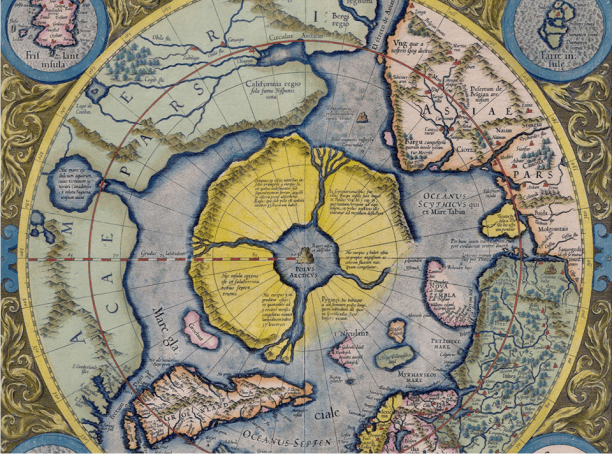
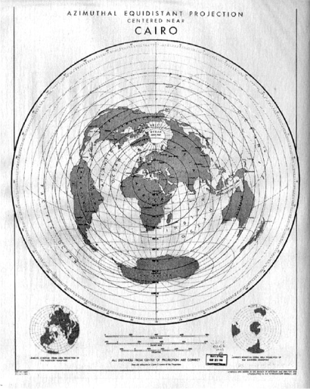
Recognizable land masses shared by unconnected mapping sources are unlikely to have been a fantasy. For further provenance, these Northern islands are described in excruciating detail in correspondence between Mercator and Sir John Dee. The North Atlantic was especially well explored by sailors from Britain and Scandinavia. The mapmakers art is seen in progress in the image at top left. This map greatly predates aircraft images and the accuracy of the mapping of South America is impressive. In the unexplored North, we see land masses that correspond to the islands. There is an interesting looking island West of South America. Pre-Copernican maps show a flat projection but Mercator's projection is accurate for the day and implies that the Arctic circle shown in modern maps is pinched and the Northern extents of Canada, Europe and Russia have been distorted to compensate. |
||
The Missing LandThe four islands in Mercator's map represent a land mass larger than the continental United States.Modern maps omit these islands, and by projection, the space in which they exist. As the Earth is flat, we know that there is no such thing as a South Pole. If we walk a straight line from the North Pole we will encounter the equator after 4,000 miles (by definition). If we walk 4,000 miles farther we encounter a large circle, 8,000 miles in radius and 50,000 miles in circumference. The Antarctic Circle is much bigger than the Arctic Circle. This is in keeping with voyage logs of Cook, Ross and Magellan, each of whom clocked nearly fifty thousand miles in the attempt to circumnavigate Antarctica. Let's draw a big purple circle, 50,000 miles around and 16,000 miles across. Let's put a top down of the accepted globe in the middle and add back Mercator's islands. |
||
|
||
|
And that is exactly what was done to our map. More than half of it is missing. It could be all water. If there are land masses we can never know because our map has no way to represent that place. It has been removed from our reality by a trick of projection. Enough ancient sources remain for us to see what has been done in the North. A little bit of math or origami shows that three quarters of the "Southern Hemisphere" is missing outright. All we know about the map of the world is what has been given to us. We can prove the map is incomplete, but there's no place on Google to look up what isn't there. |
||
|
As our civilization is largely clustered North of the equator, the North was fairly well explored in ancient times and a reasonable guess may give us a workable projection inside the equatorial circle. The South was mapped far less well, and Antarctica was not characterized until fairly modern times. Ancient explorers referred to vast southern land masses severally as Terre Australis. Its profile and extent were unknown. On the evidence in front of us it is hard to believe there is nothing in the North but ice and starving polar bears who can be saved by a single bottle of Coca Cola. (It's the real thing you know, unlike moon pictures, space pictures and maps). USGS is the premier source of global mapping data, which they get from NASA. Conspiracy wags say that stands for Never A Straight Answer. NASA presents the globe/space meme nonstop through all the media. They give us starmaps and oh-so-pretty telescope pictures. And they give us our earth maps. Most people at NASA believe in space, having gone through the same schools we did. But a few people at the top know the truth. Shadow governments run deep, and the President does not necessarily have a "need to know". But we know. And we can see that our maps are both untrue and incomplete. In Canada, the Northern limit of where you can go with your kayak is a military blockade called the DEW line. Commercial flights are not allowed to go near the pole although that would normally be the most efficient route from Europe to America. The official story is patronizing nonsense about great circle paths. The story so far... The North is frozen wasteland and no you can't go there, you have to take our word for it. Ancient mapmakers? That's silly. We didn't even have maps before satellites, and they were probably all drunk. If there ever was land up there, it sank eleven billion years ago when the asteroid wiped out the dinosaurs. |
||
|
||
|
||
|

|
|
|
|
|
|
|
|
|